If you’re planning to have “mismatched” dresses for your bridesmaids, here is how it sometimes goes. You find a palette you love- sage green, maybe, or that soft dusty blue that looks like early morning over Puget Sound. You share it with your bridesmaids. Four people order dresses from four different retailers. Someone’s sage reads more yellow-green in person. Someone else’s teal is a full shade brighter than everyone else’s. The florist gets a screenshot of a Pinterest board and does her best. The groomswear lands somewhere in the middle.
By the day of the wedding, the palette you envisioned looks almost right. But you deserve better than “almost right”. This post is for the couples who want more than a mood board, but want a practical way to get everyone on the same page before anyone orders anything. At the bottom, there’s a free printable checklist you can fill in, customize, and share directly with your bridal party, florist, and anyone else who needs to know. No chasing people down. No hoping the colors line up.
But first, the colors themselves. Because if you’re drawn to greens and blues for a Pacific Northwest wedding, you’ve landed on one of the most naturally beautiful and photographically forgiving palettes for this landscape. Let’s talk about why, and how to build it right.
Why Cohesion Beats Matching
Your bridal party does not need to be identical. Matching everyone in the exact same dress, the exact same color, is a much older idea than most couples realize, and it tends to produce photographs that feel more uniform than warm. What you actually want is cohesion: a sense that every person in the frame belongs to the same story.
The difference is the difference between a uniform and a wardrobe. Cohesion means working within a tone family, a range of related shades at the same level of depth and saturation, and letting each person find their place within it. Some can lean sage, others dusty teal, others a deeper forest. The result reads as intentional and layered in photographs, not coordinated for the camera. The single rule that holds it together: keep the value consistent. Muted with muted. Deep with deep. Bright with bright. Match the mood of the tones, not the tones themselves, and the palette will hold across your whole party and your whole gallery.
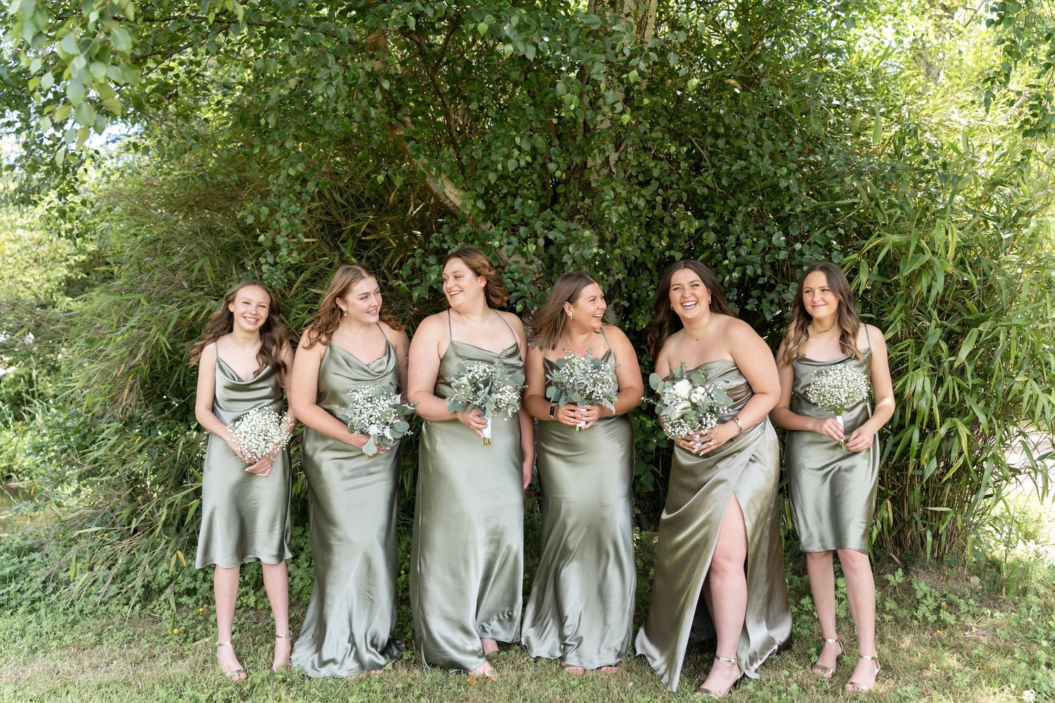
The Green Family: Shades That Belong in the PNW
Green is one of the most photogenic colors in Pacific Northwest light, and that’s not an accident. The landscape itself is built from it. Moss on basalt. Lichen on old fir. The hillsides above Snoqualmie in early October.
Sage (#B9C7B0): The quietest and most versatile shade in the family. Sage is muted enough to sit gently against every skin tone, soft enough to hold up in the diffused light of an overcast PNW afternoon without going dull. In golden hour near Mt. Rainier or Gig Harbor, it picks up a warmth that reads almost champagne, which makes it pair beautifully with ivory florals.
Dusty Green (#9CAF9D): A half-step richer than sage, with more presence without losing its softness. This is the shade that tends to look most intentional in a mixed bridal party; it reads clearly as a color choice, not just a neutral. Particularly strong in forested ceremony settings.
Eucalyptus (#7D9383): Warmer and more grounded than dusty green, with an earthy quality that photographs particularly well against the grey-blue of overcast Washington skies. If sage is soft morning light, eucalyptus is mid-afternoon in the Hoh Rainforest, deeper, more textured.
Dusty Olive (#8A8E67): The warmest shade in this family, with enough yellow-green to read as distinctly earthy. Best suited to rustic or outdoor Pacific Northwest settings. Pairs naturally with linen groomswear and greenery-forward floral arrangements.
Forest (#355845) and Emerald (#2F6B57): These are the anchors of the green family, rich, saturated, unmistakably deep. They’re extraordinary in autumn Washington weddings when the surrounding landscape is already turning, and the light is long and slanted. One note: in heavily forested settings, deep green gowns can blend into the background if you’re not intentional about positioning your party against lighter elements like stone, sky, or open field.
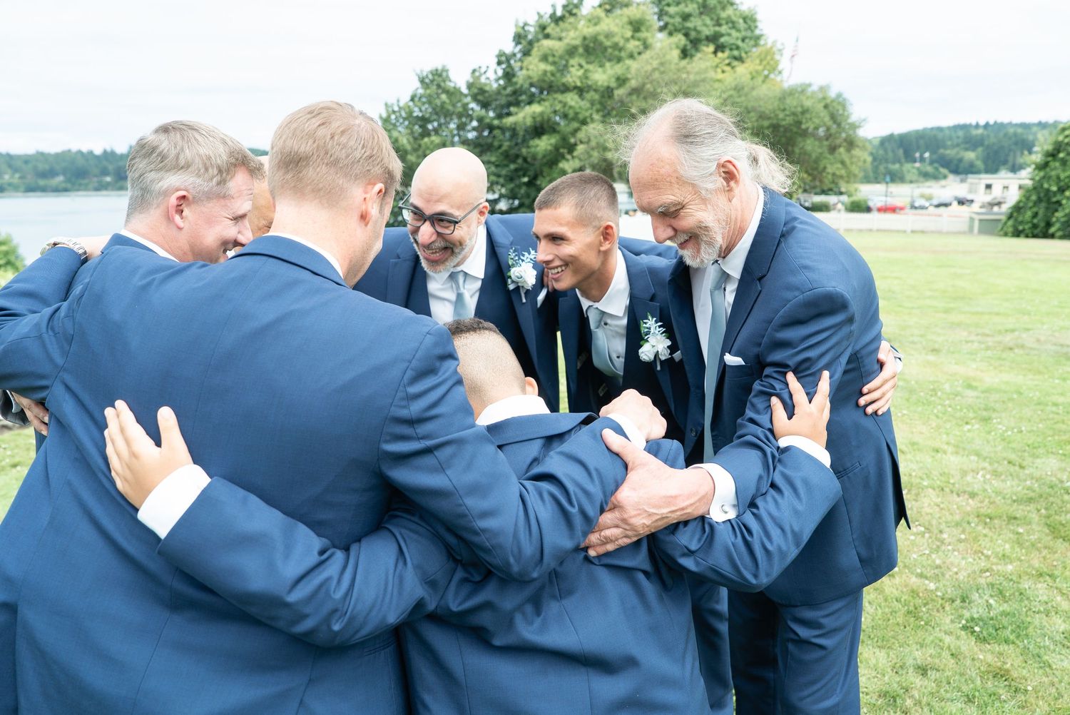
The Blue Family: The Color of the Pacific Northwest Sky
Blue connects to something elemental about this landscape. The steel of Puget Sound on an overcast morning, the pale cornflower of a clear September afternoon above the North Cascades, and the deep blue-green of Hood Canal at dusk. These aren’t invented palette choices; they exist in the world around a Washington wedding.
Dusty Blue (#9DB4C3): The most reliably photogenic shade in the blue family for outdoor PNW weddings. It is cool without being cold, soft without being pale, and it holds its quality in both overcast light and golden hour equally well. In galleries, dusty blue reads as quietly timeless never dated, never loud. If you’re choosing a single blue for your whole bridal party, this is the one.
Slate (#7F8F9A): The grey-blue that anchors a palette without pulling focus. Slate is particularly valuable in a mixed green-and-blue bridal party because it reads as a natural bridge between the two families. In photographs, it adds depth without contrast.
French Blue (#6F93B3) and Cornflower (#87A7CF): These sit a touch brighter and more saturated than dusty blue, with a gentle warmth that suits summer and early fall Washington weddings when the light runs longer. They work best when paired with other muted tones, not with deep forest greens, which would pull the palette in opposite directions.
Steel Blue (#5F7486) and Muted Navy (#46596D) The deeper end of the blue family. Rich, anchored, and genuinely elegant in low autumn light. These tones hold up beautifully against candlelight, which in a Washington October is not a small consideration. For an evening ceremony or a more architectural venue, these shades carry real quiet drama.
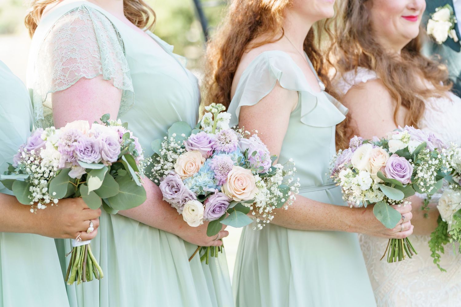
What Extends Beyond the Gowns
A cohesive palette doesn’t stop at bridesmaids’ dresses. The couples whose galleries feel most unified have thought about the whole picture early before anyone has ordered anything.
- Florals. White and ivory blooms are the most timeless choice and photograph beautifully against both green and blue gowns. Greenery-forward arrangements, eucalyptus stems, fern, olive branch feel genuinely of the Pacific Northwest and add organic texture without competing with the palette.
- Groomswear. Charcoal, warm navy, and soft black all partner naturally with this palette. For a more relaxed Washington elopement, lighter grey or ivory linen carries warmth without pulling attention.
- Your own attire. Ivory and white gowns sit against both green and blue with high, clean contrast. That contrast draws the eye naturally to you, which is after all, the point.
- The setting. The Pacific Northwest landscape already has a palette. Before finalizing your colors, think about what the backdrop will be. Deep greens can blend into a forest. Dusty blues can disappear against an overcast sky. Pairing your palette against lighter, contrasting elements in the landscape gives your photographer more to work with and gives the photographs more depth.
The Free Printable Checklist
Choosing a palette is one thing. Getting eight different people- a florist, a planner, and a rental company all aligned on it is something else. The checklist below is designed to close that gap: a single, shareable planning sheet you can customize with your couple name, date, chosen shades (with hex codes), and any vendor notes, then print or save as a PDF to send to everyone who needs it. Fill in your palette direction. Add your specific shades. Include a note for your florist, a reminder for the groomswear, whatever your day needs. Then print it once, or send it as a file, and everyone is working from the same page.
Next, finish the look with these wedding makeup artists in the Pacific Northwest.
Frequently Asked Questions
How do I explain the palette to my bridesmaids so they don't order the wrong shade? This is exactly what the printable checklist is for. Include the hex codes for each approved shade so everyone is shopping with a reference point, not just a description. “Dusty blue” means something different to every retailer.
What if one bridesmaid is wearing a different silhouette or fabric? Fabric affects how color reads in photographs; satin carries color very differently than chiffon. When you’re comparing swatches, try to see them in natural light if possible, and confirm final garment color outdoors before ordering.
Do these tones work for indoor PNW receptions? Yes, with some adjustments. In candlelight or warm Edison-bulb light, cooler blues can shift slightly warm and dusty greens deepen. Both effects tend to be beautiful. The shades to be most careful with indoors are the very pale ones (soft sage, cornflower), which can wash out under warm artificial light.
How far in advance should I finalize the palette? Ideally before your bridesmaids order anything, which means at least four to six months out for most dress retailers. Earlier if your party is large or lives in different cities. The checklist is designed to help you communicate the decision clearly as soon as it’s made.
Ready to start putting it together? If you’re still looking for a Washington wedding photographer who shoots in true-to-color and can tell you exactly how your palette will photograph in the PNW landscape you’ve chosen, I’d love to hear about your plans. 🌿 🤍